
How to Change Background Color, Size, Border Radius of Elevated Button in Flutter
Restored from an archived snapshot captured 2023-04-01. Examples may refer to earlier Flutter versions.
Previously, there was the provision of property on RaisedButton to change background color, but it is deprecated now. So, you have to use ElevatedButton instead of RaisedButton. On ElevatedButton, there is the provision of style property that is used to style the button. See the example below to know more about it.
To change Background Color, Broder Radius, Border, Elevation, and Padding of Button.
Use style property of ElevatedButton and implement ElevatedButton.styleFrom() on it.
ElevatedButton(
    style: ElevatedButton.styleFrom(
       primary: Colors.redAccent, //background color of button
       side: BorderSide(width:3, color:Colors.brown), //border width and color
       elevation: 3, //elevation of button
       shape: RoundedRectangleBorder( //to set border radius to button
                borderRaius: BorderRadius.circular(30)
            ),
        padding: EdgeInsets.all(20) //content padding inside button
   )
)
To change the size of Elevated Button
Wrap ElevatedButton() widget with SizedBox() widget to change height and widget of button like below:
SizedBox(
     height:100, //height of button
     width:300, //width of button
     child:ElevatedButton(
           //parameters of Button class
     )
)
To make Elevated Button’s width equal to parent widget’s width, pass width like below:
SizedBox(
     height:100, //height of button
     width:double.infinity, //width of button equal to parent widget
     child:ElevatedButton(
           //parameters of Button class
     )
)
Complete Flutter Dart Code:
import 'package:flutter/material.dart';

void main() {
  runApp(MyApp());
}

class MyApp extends StatelessWidget{
  @override
  Widget build(BuildContext context) {
    return MaterialApp(
        title: "Test App",
        home: HomePage(),
    );
  }
}

class HomePage extends StatelessWidget{
  @override
  Widget build(BuildContext context) {
    return Scaffold(
        appBar: AppBar(
            title:Text("Elevated Button"),
            backgroundColor: Colors.redAccent, //background color of app bar
        ),
        body:Center(
            child: SizedBox(
              height:100, //height of button
              width:300, //width of button
              child:ElevatedButton(
              style: ElevatedButton.styleFrom(
                  primary: Colors.redAccent, //background color of button
                  side: BorderSide(width:3, color:Colors.brown), //border width and color
                  elevation: 3, //elevation of button
                  shape: RoundedRectangleBorder( //to set border radius to button
                      borderRadius: BorderRadius.circular(30)
                  ),
                  padding: EdgeInsets.all(20) //content padding inside button
                ),
                onPressed: (){
                    //code to execute when this button is pressed.
                },
                child: Text("Elevated Button")
              )
            )
        )
    );
  }
}
Output Screenshot:
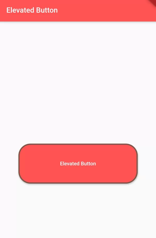
In this way, you can change the size, background color, padding, border-radius, elevation of the ElevatedButton() widget.