
How to Make Dotted/Dash Border on Container in Flutter
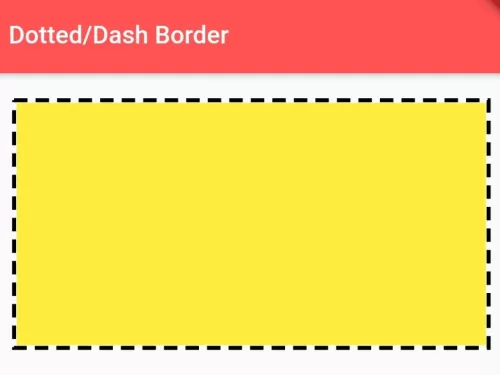
There is no provision of dotted or dashed borderline for containers in Flutter SDK yet. In this example, you can learn how to make border line for any kind of widget either its image, container, text on flutter. The output of this example:
Read this Also:\u00a0How to Add Borders to Container Widget in Flutter

You need to add\u00a0dotted_border\u00a0plugin as dependencies on your pubspec.yaml file.
dependencies:
  flutter:
    sdk: flutter
  dotted_border: ^1.0.7
Use the following Dart code example to draw a dash or dotted border on Container or on any kind of widget on Flutter.
import 'package:dotted_border/dotted_border.dart';
import 'package:flutter/cupertino.dart';
import 'package:flutter/material.dart';

void main() {
  runApp(MyApp());
}

class MyApp extends StatelessWidget {
  @override
  Widget build(BuildContext context) {
    return MaterialApp(home: Home());
  }
}

class Home extends StatelessWidget {
  @override
  Widget build(BuildContext context) {
    return Scaffold(
        appBar: AppBar(
          title: Text("Dotted/Dash Border"), //appbar title
          backgroundColor: Colors.redAccent, //appbar color
        ),
        body: Container(
           padding: EdgeInsets.all(20), //padding of outer Container
           child: DottedBorder(
              color: Colors.black,//color of dotted/dash line
              strokeWidth: 3, //thickness of dash/dots
              dashPattern: [10,6],
              //dash patterns, 10 is dash width, 6 is space width
              child: Container(  //inner container
                 height:180, //height of inner container
                 width: double.infinity, //width to 100% match to parent container.
                 color:Colors.yellow //background color of inner container
              ),
          )
        ),
    );
  }
}
This is an easy way you can draw dash/dotted border for container or any kind of widget on Flutter. To pair dashed borders with smooth corner curvature, explore border radius on Card widgets and box shadow effects on Container widgets.
Updated Flutter Example
Dashed & Dotted Borders via CustomPainter
Key Implementation Details & Modern Differences:
- Vector Path Metrics: Uses
Path.computeMetrics()andextractPath()for mathematically accurate dash segments across rounded corners. - Zero-Dependency Implementation: Replaces bloated unmaintained third-party packages with a clean, lightweight
CustomPainter. - Dynamic Parameter Controls: Allows runtime toggling between fine dotted and broad dashed styles with full repaint optimization.
import 'package:flutter/material.dart';

void main() {
  runApp(const MaterialApp(home: ModernDottedBorderDemo()));
}

/// CustomPainter rendering dashed and dotted borders around rounded rectangles.
class DashedBorderPainter extends CustomPainter {
  final Color color;
  final double strokeWidth;
  final double dashLength;
  final double dashGap;
  final double borderRadius;

  const DashedBorderPainter({
    required this.color,
    this.strokeWidth = 2.0,
    this.dashLength = 6.0,
    this.dashGap = 4.0,
    this.borderRadius = 12.0,
  });

  @override
  void paint(Canvas canvas, Size size) {
    final paint = Paint()
      ..color = color
      ..strokeWidth = strokeWidth
      ..style = PaintingStyle.stroke;

    final rect = Rect.fromLTWH(0, 0, size.width, size.height);
    final rrect = RRect.fromRectAndRadius(rect, Radius.circular(borderRadius));
    final path = Path()..addRRect(rrect);

    for (final metric in path.computeMetrics()) {
      double distance = 0.0;
      while (distance < metric.length) {
        final double length = (distance + dashLength < metric.length)
            ? dashLength
            : metric.length - distance;
        final extract = metric.extractPath(distance, distance + length);
        canvas.drawPath(extract, paint);
        distance += dashLength + dashGap;
      }
    }
  }

  @override
  bool shouldRepaint(covariant DashedBorderPainter oldDelegate) {
    return oldDelegate.color != color ||
        oldDelegate.strokeWidth != strokeWidth ||
        oldDelegate.dashLength != dashLength ||
        oldDelegate.dashGap != dashGap ||
        oldDelegate.borderRadius != borderRadius;
  }
}

class ModernDottedBorderDemo extends StatefulWidget {
  const ModernDottedBorderDemo({super.key});

  @override
  State<ModernDottedBorderDemo> createState() => _ModernDottedBorderDemoState();
}

class _ModernDottedBorderDemoState extends State<ModernDottedBorderDemo> {
  double _dashLength = 8.0;
  double _dashGap = 5.0;

  @override
  Widget build(BuildContext context) {
    final theme = Theme.of(context);

    return Scaffold(
      appBar: AppBar(title: const Text('Dotted & Dashed Border Container')),
      body: Padding(
        padding: const EdgeInsets.all(24.0),
        child: Column(
          crossAxisAlignment: CrossAxisAlignment.start,
          children: [
            CustomPaint(
              painter: DashedBorderPainter(
                color: theme.colorScheme.primary,
                strokeWidth: 2.0,
                dashLength: _dashLength,
                dashGap: _dashGap,
                borderRadius: 16.0,
              ),
              child: Container(
                width: double.infinity,
                padding: const EdgeInsets.symmetric(vertical: 40.0),
                alignment: Alignment.center,
                child: Column(
                  children: [
                    Icon(
                      Icons.cloud_upload_outlined,
                      size: 48,
                      color: theme.colorScheme.primary,
                    ),
                    const SizedBox(height: 12),
                    Text(
                      'Drag and Drop Files Here',
                      key: const Key('dashed-box-label'),
                      style: theme.textTheme.titleMedium,
                    ),
                    const SizedBox(height: 4),
                    Text(
                      'Dash: ${_dashLength.toInt()}px, Gap: ${_dashGap.toInt()}px',
                      key: const Key('dash-params-label'),
                      style: theme.textTheme.bodySmall,
                    ),
                  ],
                ),
              ),
            ),
            const SizedBox(height: 24),
            Row(
              children: [
                FilledButton.tonal(
                  onPressed: () {
                    setState(() {
                      _dashLength = 3.0;
                      _dashGap = 3.0; // Dotted effect
                    });
                  },
                  child: const Text('Fine Dotted'),
                ),
                const SizedBox(width: 12),
                FilledButton.tonal(
                  onPressed: () {
                    setState(() {
                      _dashLength = 12.0;
                      _dashGap = 6.0; // Broad Dashed
                    });
                  },
                  child: const Text('Broad Dashed'),
                ),
              ],
            ),
            const Divider(height: 36),
            Text(
              'Modern Architecture: Flutter BoxDecoration does not natively provide dashed '
              'or dotted styles. A lightweight CustomPainter using PathMetric.extractPath() '
              'renders performant, resolution-independent borders with zero external dependencies.',
              style: theme.textTheme.bodySmall?.copyWith(
                color: Colors.grey[700],
              ),
            ),
          ],
        ),
      ),
    );
  }
}
Document History & Archival Record
Original reference snapshot archived March 22, 2023. Updated working solution verified on modern Flutter & Dart SDKs.